Today was our last InDesign session. We went more into depth about printing and how to prepare files to print successfully.
In the afternoon we had an 'Ideas generation' session with Kit and Justin and we looked at typography more in depth. We were shown various typographic designs and had to interpret them by given words we thought described them best.
The idea of this session was to make us more aware of how type itself can transmit a message.
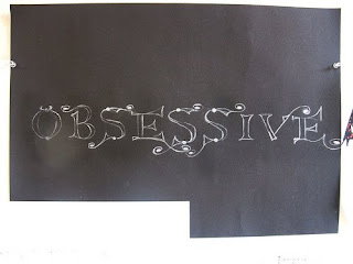
We were also given a mini brief. We had a very short period of time to create a piece of expressive typography based on a word that described our Typeradio Designer. So basically, one word, one font and a maximum of two colours.
The first two words that came to my mind when thinking of Michael Bierut were, 'Obsessive compulsive'. He speaks about this in his interview. I decided to use the word obsessive. In regards to the typeface, I wanted something very detailed, very carefully thought out. The typeface I chose was: 'Koster Swash'. The idea was to portray the obsession with detail that people that suffer from this disorder have. I decided to use black and white because Michael Bierut's seems to work with these two colours most of the time.


hello... hapi blogging... have a nice day! just visiting here....
ReplyDelete